Stock Market and Currency Update 24 April 2010
Stock market and currency update as of the week ending Friday, 23 April 2010.
It has been some time since my last update (due to personal time constraints associated with my flying schedule). However, I have continued to monitor the markets on a daily basis and am now able to put out an update.
I hate sounding like a "broken record" but my basic message remains unchanged:
"We are in a long term bull market with all intermediate-to-long term charts bullish. We remain overbought in the short term and could experience a short term pullback at any time."
The situation has not changed but there are some interesting developments that should be noted. Proceed to the charts below to read the updates.
Click on all charts to enlarge:
STOCK MARKET:
SPX 11 year monthly:

This "long term" chart of the S & P 500 index turned bullish at the end of July, 2009 when price at the close of July closed above the 12 month simple moving average along with confirmation of the associated technical indicators.
Price continues to remain bullish and there is no indication from this long term chart that the current bull market is in any danger.
The one cautionary note I would make is that price has now risen to the "last stand" area for the bears; the 61.8% Fibonacci retracement level from the entire bear market decline. This level is 1228.74 (Fridays close was 1217.28).
I would be remiss to not point out that the last bear market decline similar to the one we just experienced was 1929-1933 (during the Great Depression). During that decline, price also retraced 60% of the initial decline before the next plunge began. Look at the following chart very closely:
DOW Performance 1929-1933:
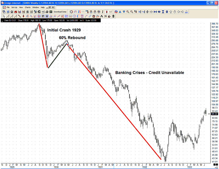
Note price rose 60% from the initial bottom and peaked the 3rd week of April, 1930. Then it turned south and plunged for an additional 2+ years before the REAL bottom.
I am not saying we are in for the same as history seldom repeats but sometimes history does rhyme. Are we in for something similar again? Is is coincidence we have retraced 60% from the initial decline and it has occurred during the 3rd week of April? Hmmmmm.
The long term chart remains BULLISH with a healthy dose of caution.
SPX weekly with volumetric:

This weekly chart goes back to the market top of Oct, 2007 to capture volumetric support and resistance.
It is noted the "official" bull market began in July when the 13 week exponential moving average crossed above the 34 week exponential moving average. The last short term bull market correction signal was in Jan, 2010 with a bull market continuation signal in late Feb. As of today, all indicators are bullish.
Things to note on the chart:
1) the RSI is now oversold on a weekly basis. This makes the chances of a sharp intermediate decline more likely.
2) price has carved out a bearish rising wedge and is currently right at the top of the wedge. A break above this would be bullish and target the top of the rising channel around 1350. However, a break of the lower trend line would probably signal the start of a bear market decline.
Once again, the medium term chart looks BULLISH but caution is advised given the technically overbought conditions on the weekly chart.
SPX Point and Figure (traditional):

The PNF chart turned bullish no a price break above 930 and still points to a target of 1295.
This chart has been consistently BULLISH (and correct). It remains so as of today.
SPX daily with volumetric:

A daily chart from the March, 2009 bottom that shows the current up trending channel and the levels of volumetric support below current prices. In the event of a short term decline, I would look for the 1170'ish level to provide initial support followed by stronger support near the 1120'ish level.
SPX 6 month daily:

The short term 6 month daily chart remains bullish. Price continues to rise from the 1044 bottom in early Feb and has achieved unbelievable gains.
Price remains overbought on both the RSI and Stochastic but these conditions can continue for some time. They are not a "sell" signal unto themselves but a sign that the market is not a "bargain" at current prices. That has not prevented the bulls from pushing this even higher.
The only thing I can say is it is a bullish development that price broke above the recent 9 day consolidation zone on Friday. This is bullish and could signal the next upward thrust into even MORE overbought conditions.
Given this development, I may take some increased exposure to my provident fund account depending on how the futures behave on Sunday night and how the Far East trading fairs overnight on Sunday. More on that strategy below.
Overall the short term picture remains BULLISH.
CURRENCIES:
The 1st chart is a review of the performance of various major currencies since the U.S. dollar bottom of 25 November 2009.
Currency performance since the USD bottom of 25 Nov 2009:

The performance of the various non-USD currencies are compared to the USD while the USD Index rate of return is compared to the "basket of currencies" that make up the USD index as follows:
U.S. Dollar Index composition:

Obviously the Euro has the greatest influence on the USD index given its over-weighting within the index so it is important to analyze both the USD index as well as the Euro itself.
USD 10 year monthly:

The long term monthly chart of the USD turned BULLISH at the end of Feb, 2010. All long term indicators are positive.
USD 2 year weekly:

The intermediate term chart of the USD turned bullish in early Dec, 2009.
Price had carved out a nice rising channel that was broken to the downside 3 weeks ago. Price has since consolidated and may be forming a new lower-slope channel shown with the dotted red lines.
Irrespective, the USD still remains BULLISH as long as price remains above the consolidation zone (shown in the shaded gold area) with a floor of 79.51.
USD 6 month daily:

The 6 month USD daily chart shows the channels and consolidation area in greater detail. All short term technical indicators are positive and it would be expected price will break above this consolidation zone.
Any daily close above 82.24 would be a continuation buy signal with a daily close below 79.51 a bearish reversal signal. In between is a consolidation area with no clear direction.
Overall the USD remains BULLISH in the short term.
Euro 10 year monthly:

The long term chart of the Euro turned bearish in Jan, 2010. No changes here.
While the month is not yet over, it is important to note we have broken below the previous support level around 136'ish. A much stronger level of monthly support is near the 126'ish level (as shown on the chart). That would be my 1st target for this decline. Following that I think 117 is reachable.
Euro 3 year weekly:

The medium term chart of the Euro turned bearish the 1st week of Dec, 2009 and remains bearish. Of note this week is the fact the closing price on Friday, while not a "new daily low" for this decline, is in fact a new weekly closing low. This is a further bearish development.
I have shown the area of consolidation on the chart (black dotted lines) that the Euro entered into in early Feb, 2010. This has formed a "flag pattern" which has been confirmed as of Friday's weekly close. Should this pattern complete (there is no guarantee it will but the odds favour it) it points to a target of 116.76. Note this is the same level of support I spoke about previously on the monthly chart above. Just something to keep in mind.
All technical indicators remain bearish and there is no indication we will not go down to test the 123'ish-125'ish levels.
Euro 6 month daily:

The 6 month daily chart shows the consolidation area spoken above previous. On a DAILY closing basis we are still within the range.
A daily close below 132.69 would be very bearish. Until then, the consolidation range on the daily chart remains intact with all short term technical indicators bearish.
Bottom Line:
My comments from my last update remain unchanged WITH ONE EXCEPTION.
The markets continue to be bullish both in the short, medium and long term. They are overbought in both the short and medium term but are just fine in the longer term. As such, I am expecting a pullback in the short-medium term at any time but there is no indication it will result in the start of a new bear market (notwithstanding my comments above about similarities between our current situation and the 1930's situation).
I remain long term bullish on the markets and would normally never buy at these overbought levels (as I have discussed previous). I have continued to wait for a decent pullback from the Feb lows to commit new capital to the provident fund account. That opportunity has not been forthcoming.
Friday's closing price above it's previous consolidation range is a very bullish sign. It is possible there is so much liquidity within the system currently (given the 10 Trillion dollars in money printed and injected into the world-wide economy over the past 2 years) that this "rocket ride" north may continue for some time. This (of course) will be another bubble that at some point will burst but for the time being governments are standing aside and doing nothing to take away the punchbowl.
Emirates Provident Fund:
I plan on adding to my current positions on Monday under the following conditions:
1) if the U.S. futures are positive overnight on Sunday, and
2) if the Far East markets are well behaved overnight on Sunday.
If this occurs, I will commit a further 15.4% to my equity positions to bring my portfolio weighting to a 75% equity/25% USD cash position.
These funds will go into the Black Rock Managed Equities portfolio for "technical" reasons I will discuss in my next blog (following after this).
As of today my "strategic positioning" within the Emirates Provident Fund A and B accounts remains unchanged at a 50% Equity/50% USD cash position.**
Current positions as of 23 April 2010:
-Equities: 59.6%
-USD Cash: 40.4%
** "Strategic positioning" percentages are as per how funds were originally allotted. Due to daily market price fluctuations and ongoing equity monthly purchases within the provident fund account these amounts will vary several percent from that posted. Consult "current positions" for updated actual positions held.
Emirates Capital Asset Management (ECAM) Asset Allocation Fund
The ECAM Asset Allocation Fund is currently 50% invested (40% core holdings invested + 10% discretionary invested) and 50% cash.
The fund rotated recently, having taken profits on it's Developed Markets (non-U.S.) and Emerging Markets positions. I am comfortable with it's somewhat defensive positioning at this moment given current market conditions.
Current holdings:
Core (40%):
-U.S. Large cap equities:10%
-U.S. Small cap equities: 5%
-U.S. Real Estate Investment Trusts (REITs): 10%
-U.S. Domestic bonds: 10%
-U.S. Inflation protected bonds: 5%
Discretionary (10%):
-Gold mining stocks: 5%
-Biotech stocks: 5%
The fund has continued to perform very well and, as previously promised, when I have time I will give updated quarterly performance data as well as returns for the past 3 years.
Legal Disclaimer: The content on this site is provided without any warranty, express or implied. All opinions expressed on this site are those of the author and may contain errors or omissions. NO MATERIAL HERE CONSTITUTES "INVESTMENT ADVICE" NOR IS IT A RECOMMENDATION TO BUY OR SELL ANY FINANCIAL INSTRUMENT, INCLUDING BUT NOT LIMITED TO STOCKS, OPTIONS, BONDS OR FUTURES. The author will reveal his current market positions and holdings but actions you undertake as a consequence of any analysis, opinion or advertisement on this site are your sole responsibility. The author is not licensed as an investment advisor in the UAE and therefore cannot provide individual account advice to individuals and/or institutions.
dwaynemalone1@gmail.com
posted by Emirates Capital Asset Management @ 12:50 PM
0 Comments
![]()
![]()

0 Comments:
Post a Comment
Subscribe to Post Comments [Atom]
<< Home