Market update 28 February 2011
It has been an interesting few weeks since my last update. The unrest in the Middle East resulting in oil prices spiking has been a key development that needs to be monitored over the next few weeks. The direction of oil will dictate the direction of the markets going forward near term.
(My apologies for any font/format errors as this is a new blog format that was sprung upon me unexpectedly and it is taking some effort to figure it out! It is very user unfriendly and I hate change).
Instead of going over every event, here is a good summary courtesy of John Nyaradi at Wall Street Selector:
It was quite a week with revolution coming to Tripoli, Libya, and Madison, Wisconsin, while the economic and earnings news could only be described as dismal.
Market tremors early in the week caught the "buy on the dip" crowd off guard while Congress worked to avert a government shutdown this coming week and the "new austerity" threatens to trigger a double dip recession at home.
With Brent Crude oil now at $112/bbl, a 2 1/2 year high, and West Texas Intermediate (USO) close to $100, we see new headwinds blowing against the "Bernanke Put," and so, all in all, I'm beginning to feel like a driver in the picture, like we're on a road with no way out.
The View From 35,000 Feet
Libya was the big news, of course, with revolution and the world rallying against a bad guy who has been a thorn in the side of the Western world for decades. Of course the important issue from an economic standpoint is oil, since Libya is #18 on the list of oil producing nations and contributes 2% to world supplies with as much as 80% of their exports going to Europe and Italy, in particular. Libyan oil is light and sweet and easy to get to Europe and any alternative is going to cost more and boost prices on the Continent.
Of course, with oil prices escalating, at home we've seen gas prices rise more than 15 cents a gallon in recent weeks, and many analysts are calling for $4 or even $5/gallon gasoline at American pumps. Its simple economics to know that increased energy costs add a "tax" to American consumers who will have fewer dollars left over to spend if more dollars are going into the tanks of our cars.
Meanwhile, the protests continue in Wisconsin which is just a harbinger of problems to come in other states as states and cities slash budgets to balance deficits, since, unlike the federal government, they aren't allowed to print money. Now we have "The Wisconsin 14," the 14 Democratic Senators who went AWOL to protest the Governor's proposals, and all of this is eerily reminiscent of other marches in Madison some 40 years ago during the height of the Viet Nam war.
In the United Kingdom, GDP was revised yet further downward, confirming the start of a double dip recession in the British Isles, while United States 4th Quarter GDP was revised downward to 2.8% from initial estimates of 3.2% for the 4th Quarter, putting us perilously closer to the flat line here at home.
Goldman Sachs (GS) estimates that the proposed spending reductions in Congress could cut GDP by a further 1.5-2% and so, there we are, trillions later, with the threat of another recession looming ever closer on the horizon.
The recession has already returned to the housing industry (ITB) (if it ever really ended) with the Case/Shiller Index pointing out a continued decline in housing prices of 3.9% in their latest report last week.
Earnings continue to be overall positive, however, Hewlett Packard (HPQ) and Wal-Mart (WMT) were punished last week for missing expectations, and one can only wonder, if Wal-Mart can't make it, who can?
But not all news was bad, with consumer confidence rebounding, a decline in weekly unemployment claims and a rise in durable goods orders offsetting the negative news.
What It All Means
Now we come to yet another intersection, and is it one where all roads lead to nowhere?
The trillions that have been thrown at inflating the economy are being erased by the rapidly rising price of oil, proposed government cutbacks on the Federal level, reduced spending on the state level and the continuing erosion of the value of most peoples' most significant asset, their home.
It's unlikely that the rolling revolutions on the southern shores of the Mediterranean are going to end anytime soon, and if the contagion should spread to Saudi Arabia or escalate in Bahrain, the situation will become yet dicier.
Gross Domestic Product is defined as (Private Consumption + Gross Investment + Government Spending + Net Exports) and so if one takes a big bite out of a big component like Private Consumption (gasoline prices) or Government Spending, (proposed state and Federal cuts) the results are simple eighth grade mathematics.
We now are perilously close to a double dip recession at home, and I think this dismal possibility grows more likely by the day due to the factors mentioned above.
The S&P 500 Index was down 1.72% last week. As I posted previous, February has a history of being one of the weaker months in a given year but for the month of Feb we are currently up 2.62%. This is exceptional strength and cannot be ignored.
It appears from all indicators that an incredible amount of money is being thrown into the markets by the U.S. Federal Reserve. The hope is that the Fed can prop up the U.S. stock markets to create the "Wealth Effect" whereby the average investor feels so good about his rising stock portfolio that he/she will go out and buy more goods and services (including eventually houses). This (in theory) would feed into a new self-sustaining economic recovery:
-More money in stock portfolio = consumer feels wealthier.
-Consumer feels wealthier = go buy more goods/services.
-Go buy more goods/services = unemployment levels decline.
-Unemployment levels decline = more consumers to buy more goods/services.
-Cycle complete.
The 1st part of the plan appears to be on track (wealth effect). The key will be to see if this translates into greater consumer spending and lower levels of unemployment. The latest GDP numbers were not encouraging and the monthly jobs report for the month of Feb (out 04 Mar) will be interesting to monitor.
 |
| SPX 60 Minute Chart |
This past week a key trend line was broken. This trend line was the bottom of a rising bearish wedge which formed in Aug/Sept. A 5 wave Elliott wave uptrend pattern appears to be completed. If so, we could expect a 3 wave decline (A-B-C) to retrace some of the recent gains.
Price came back on Friday to test the bottom of the trend line. This is a typical retrace and the next few days will be critical. Unless the markets can close above 1344 it must be assumed a short term decline is in place.
Typically a broken wedge will retrace 50%-61.8% of the rise (shown on the chart). However, given the market strength over the past few months we may get a much more shallow retrace before the next market advance.
 |
| SPX 1 Year Daily Chart |
I have drawn a simple 1 year chart of the SPX with a 50 day simple moving average in blue. Note the 50 day SMA has been a key level of support/resistance the past year.
The 50 sma is currently @ 1289. It is reasonable to assume a retrace to at least this level. A break below would be a bearish development.
 |
| Provident Fund Daily Ratio Chart The short term Provident Fund daily ratio chart switched to bearish stocks for the 1st time since Sept 2010. It has attempted to regain the 50 dma but as of Friday was still indicating International Bonds (priced in USD) as the preferred investment over International Stocks (priced in USD) or USD cash in the short term . |
 |
| Provident Fund Weekly Chart The intermediate-long term term Provident Fund weekly ratio chart remains bullish International Stocks (priced in USD) as the preferred investment over International Bonds (priced in USD) or USD cash. |
 |
| Provident Fund Weekly (Australian Dollars) The intermediate-long term Provident Fund weekly ratio chart remains bullish International Stocks (priced in USD) as the preferred investment over International Bonds (priced in USD) or Australian Dollar cash. |
 |
| Provident Fund Weekly (Euro) The intermediate-long term Provident Fund weekly ratio chart remains bullish International Stocks (priced in USD) as the preferred investment over International Bonds (priced in USD) or Euro cash. |
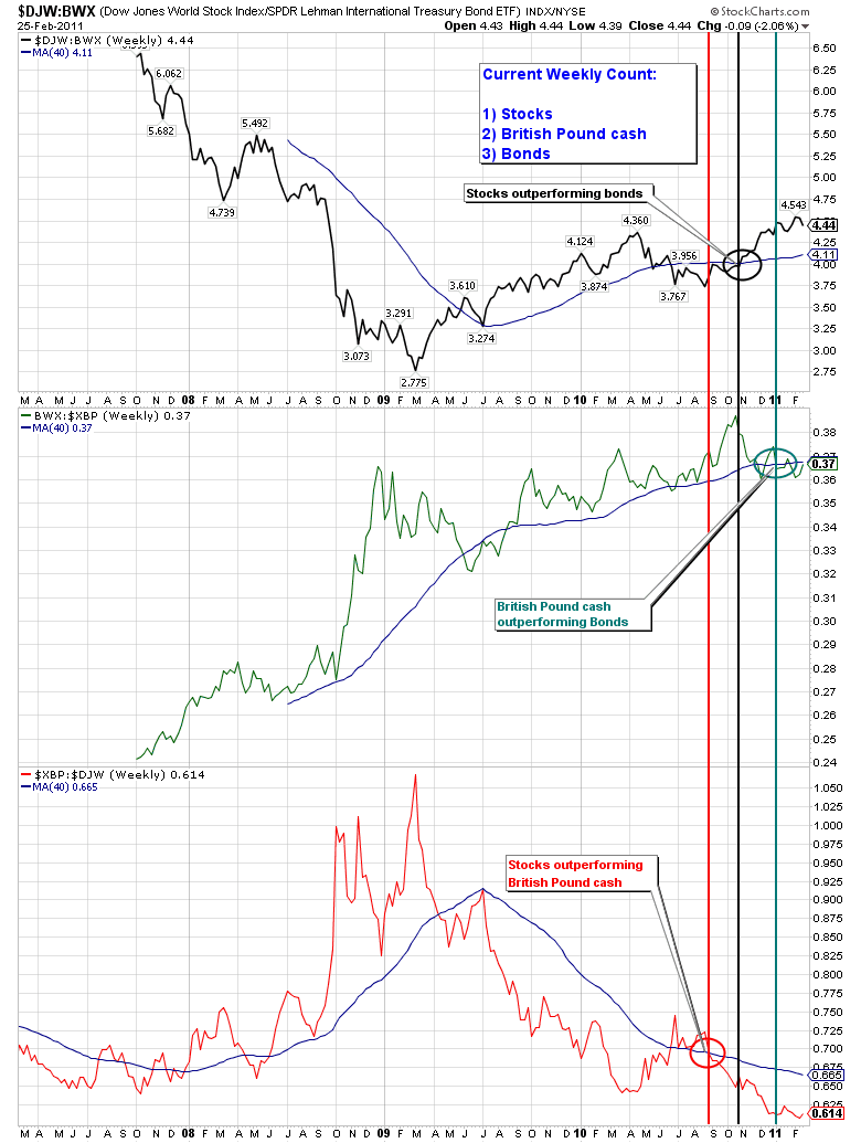 |
| Provident Fund Weekly (British Pound) The intermediate-long term Provident Fund weekly ratio chart remains bullish International Stocks (priced in USD) as the preferred investment over International Bonds (priced in USD) or British Pound cash. Bottom Line: -My short term technical indicators (not shown today) have switched to bearish with the intermediate-long term indicators still bullish. -Combined with the bullish cycle period we are currently in (yearly cycle bullish, 4 year cycle bullish), we have entered the technical "sweet spot" for equity investing. I have been waiting for an opportunity to increase my equity exposure within the Provident Fund. It appears that moment has arrived. I will be watching my short term indicators closely and when they return to bullish I will be increasing my equity exposure within my Provident Fund account to a 75% equity position. Any changes will be blogged when completed. Emirates Provident Fund: As of Monday, 28 Feb I remain in a strategic 25% equities/75% USD cash weighting as follows:** -BlackRock US Dollar Cash Portfolio Fund: 75% -Russell Global 90 Fund: 15% -Fidelity International Fund: 10% **Actual positions will change daily based upon price action and market volatility. Legal Disclaimer: The content on this site is provided without any warranty, express or implied. All opinions expressed on this site are those of the author and may contain errors or omissions. NO MATERIAL HERE CONSTITUTES "INVESTMENT ADVICE" NOR IS IT A RECOMMENDATION TO BUY OR SELL ANY FINANCIAL INSTRUMENT, INCLUDING BUT NOT LIMITED TO STOCKS, OPTIONS, BONDS OR FUTURES. The author will reveal his current market positions and holdings but actions you undertake as a consequence of any analysis, opinion or advertisement on this site are your sole responsibility. The author is not licensed as an investment advisor in the UAE and therefore cannot provide individual account advice to individuals and/or institutions. dwaynemalone1@gmail.com |
posted by Emirates Capital Asset Management @ 1:20 PM
0 Comments
![]()
![]()


